Dhanashree Bhagwatkar
UX Infrastructure at Scale:
How Greenworks’ Design System Enabled Platform Consistency and Speed
Tools
Figma | JIRA | Google Docs
Role
Owner & Manager
Deliverables
Design library | Component guideline | Design tokens | Documentation
Duration
3 months
Impact
↑30%
Task Completion Rate
70%
User led Errors
↑45%
Design - to - Dev Handoff Velocity

Overview
Since joining Greenworks Tools, I led the definition and evolution of a unified design system to support the company’s growing digital ecosystem across commerce, account, and lifecycle experiences.
The system serves as the foundational UX infrastructure for high-traffic customer-facing surfaces, including PDPs, PLPs, cart and checkout flows, and account dashboards, while enabling consistency and velocity as the platform scales.
The Greenworks Design System was developed as a strategic response to fragmented UI patterns, inconsistent interaction behaviors, and increasing execution overhead across teams. To address this, I approached the system using a structured, iterative model, beginning with discovery to understand existing patterns and team workflows, followed by a phased execution plan that defined foundations, reusable components, and usage guidelines.
Core tokens, atomic components, and composable patterns were introduced incrementally, allowing teams to adopt the system without disrupting active roadmaps. Feedback loops with Product and Engineering were built into each release cycle, enabling continuous refinement while improving design-to-development velocity, reducing rework, and raising experience quality across the platform.
.png)
Discover & Define
Beginning with the discovery stage, my objective was to uncover the precise problems that users of the website and the mobile app were facing, as well as their needs and pain points when utilizing the current practices.
To accomplish this, I conducted interviews with over 2 vendor UX Teams and internal supporting teams responsible for various digital products within the organisation, gathering valuable insights from both designers and front-end developers.
When preparing user testing, I need to set up all the interactions manually for some commonly used component, like checkbox and radio, which is time-consuming.
UX Researcher
It would be better to align components style in different products.
Supporting UI Designer
There’s always padding/spacing inconsistency between screens and journeys. We don’t know which one we should follow.
Front -end Developer
I have no idea which components are ready to use. And where should I raise if there’s new components needed?
Supporting UX Designer
I don’t know which is the correct assets to use - too many libraries at the same time.
UI Designer from Website
We hope design team can provide clear guideline on different states of a component, including edge cases.
Front-end Developer
The existing design system is messy and full of unrelated explorations.
Senior UX Designer from App Team
Challenges
Concurrently, through thorough research of existing brand guidelines and design files, I gained a better understanding of the challenges the team was experiencing:
01
There was confusion among designers as multiple libraries were available simultaneously, making it difficult to determine which components were correct to use.
02
Designers resorted to building components in separate local design files due to uncertainty regarding their reusability across different projects.
03
There was a misalignment between design and production, as clear guidelines were lacking for various states, behaviors, interactions, and use cases.
04
The existing design system was not sufficiently organized, making it challenging to easily search for specific components.
05
There was a lack of clear product design instructions in the global brand guideline, which predominantly focused on printed materials, PowerPoint presentations, posters, and reports.
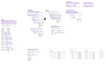

Example of former components in a local design project
Brand Guidelines
Problems to Solve
To summarize the findings by "How might we" questions
How might we
structure and organize the design system so that users can easily find out the correct components to use?
How might we
apply interaction in design system to help better visualize the real product in prototype and user testing?
How might we
create a design system applicable for all the products under the
E-commerce branch?
How might we
create a design system applicable for all the viewports?
How might we
deliver a clear guideline to developers so that there will be no misalignment between design and dev?
Misalignment of icons and spacing issues
Every icon follows a different style
Inconsistent border radius and Stroke width

Inconsistent button style
Button hierarchy not defined
Inconsistent Spacing between elements
Design & Validate
Prior to commencing the design phase, I formulated a concise plan and established an estimated timeline.
This served to assist senior management in visualizing the prioritization of resources and setting expectations regarding the subsequent steps and the anticipated final outcome within a specific timeframe.

Design System Roadmap & Planning
Configurable
Designers can now effortlessly and intuitively configure components within Figma.
For instance, when working with an accordion, designers can readily access the desired variations through the variant panel. With the optimization brought by Figma, which includes the ability to set boolean and text properties, designers can conveniently configure all component variations from a centralized location.

Scalable
Thanks to a meticulously established auto-layout system, all components within the design system are now seamlessly scalable across various viewports. From mobile (375px) to tablet (768px), desktop (1024px), and even ultra-wide screens (1440+px), designers can effortlessly utilize the components to create UIs of any desired screen size.

Interactive
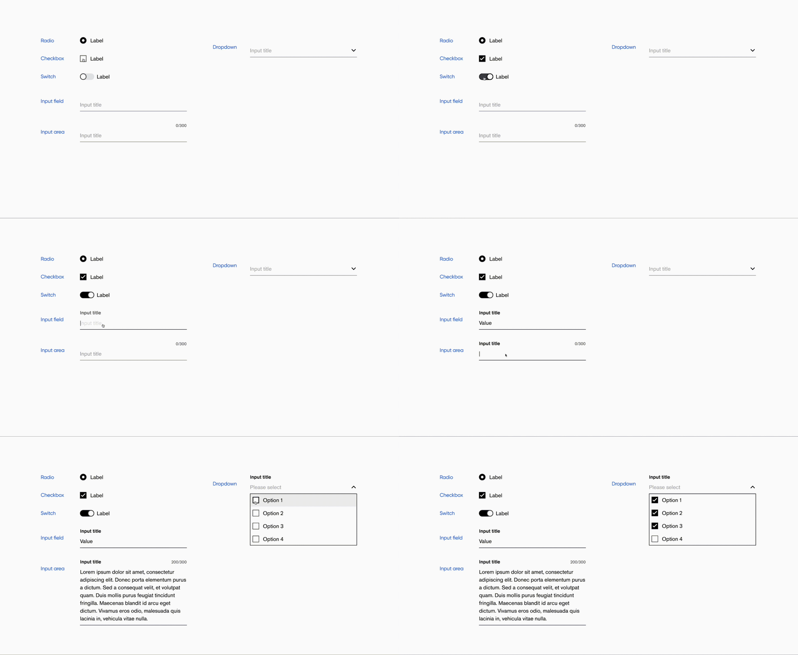
Presenting design work to cross-functional stakeholders at Greenworks required prototypes that accurately reflected real product behavior, not static screens. High-fidelity, interactive prototypes made it easier for teams to understand complex flows, evaluate decisions, and align on experience quality, especially when micro-interactions played a critical role in clarity and usability.
A key strength of the Greenworks design system was its comprehensive definition of interactive states across components, all connected within shared prototypes. This ensured that when designers reused system components, interaction behaviors and micro-interactions were applied consistently by default—bringing experiences closer to production reality while improving stakeholder confidence and design efficiency.
Universal
Given the breadth of Greenworks’ digital ecosystem, including customer-facing commerce experiences and internal operational tools, the design system was built to accommodate variation while providing flexible, clearly defined usage options for designers across different product contexts.

Accessible
Accessibility was treated as a core requirement in the development of the Greenworks design system, not a post-release consideration. All components were designed and validated against WCAG 2.x guidelines prior to release to ensure experiences were usable and inclusive across a wide range of users and environments.
Each system release included structured accessibility reviews covering color contrast, keyboard navigation, focus states, screen reader support, and overall readability. By embedding these checks into the system workflow, accessibility standards were applied consistently across products while reducing downstream rework for design and engineering teams.

Design System Structure
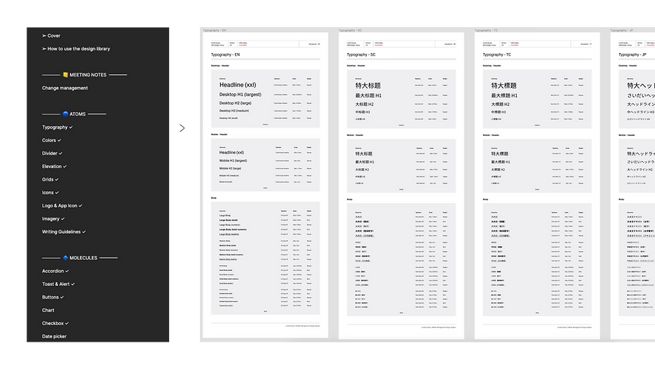
I have meticulously structured the content within our Figma master library, starting with a comprehensive guideline on system usage and the methodology employed to organize the system. Following the principles of atomic design, our library begins with atom-level components, followed by molecules, organisms, and so on.
The final section encompasses additional supporting information, such as planning and timeline documentation,
a UX wireframe kit, and component page framework controls.
This organization ensures clarity and efficiency when navigating the library's content.
.png)


Design Tokens
To establish a scalable and consistent visual foundation across Greenworks’ digital products,
I partnered with Design Ops Vendor to define a structured design token architecture.
This approach enabled systematic management of core visual attributes, such as color, typography, spacing, and states, while ensuring consistency, flexibility, and efficient handoff across design and engineering workflows.

Base Token
We began by creating base tokens to define all fundamental values, including colors, typography, and spacing.

Purpose Token
The purpose token is to systemize the design language for a specific theme or context. These purpose tokens effectively communicate the intended function of a token, particularly when a value with a singular purpose is used in multiple instances or locations.

Handoff
Clear, structured documentation was established as a core part of the Greenworks design system workflow.
Each component was documented with usage guidelines, interaction behaviors, state definitions, and implementation considerations, ensuring teams understood not only how components looked, but how they were intended to function across different contexts.
This shared source of truth aligned design and engineering around consistent expectations, reducing ambiguity and rework.
By standardizing component documentation and handoff practices, we improved delivery predictability, maintained experience quality at scale, and supported faster development across teams.

Dev Sheet

Specifications
By directly integrating design tokens and components into the documented workflow, ambiguity across design and development was significantly reduced. This streamlined handoff created a shared understanding of intent and behavior, enabling engineers to implement components with greater confidence, consistency, and precision, without relying on assumptions from legacy patterns.
Developement
Enabling Faster Feature Delivery at Greenworks
With a standardized component library and clearly defined usage guidelines, teams implemented consistent UI patterns across commerce and account experiences without reinterpreting designs. This reduced design–engineering back-and-forth and allowed development efforts to focus on feature logic and performance rather than UI reconstruction.
Replacing Legacy and Ad-hoc UI Patterns
Legacy and ad-hoc UI elements were progressively replaced with system-native components aligned to shared platform APIs and interaction standards. This migration addressed accumulated technical debt and improved consistency across PDPs, PLPs, and account surfaces.

As component logic was simplified and patterns consolidated, the codebase became lighter and more predictable.
In select high-traffic surfaces, simplifying component implementations contributed to double-digit improvements in render performance and material reductions in development effort, without sacrificing experience quality.
Final Designs & Outcomes
The delivery of a scalable design system alongside the redesign of core commerce and account experiences strengthened experience consistency, improved decision clarity for users, and streamlined cross-functional execution.
Together, these efforts helped reduce friction across key journeys, increased confidence in the platform, and positioned Greenworks to scale more efficiently as the business grew.
Before

After implementing Design System into every consequent project

Conclusions & Learnings
The Greenworks case study reinforced how system-level design decisions can unlock impact beyond individual features.
By aligning experience strategy, design systems, and execution across teams, the platform evolved from a collection of isolated improvements into a more cohesive, scalable ecosystem.
Key learnings from this work that are applicable to similar large-scale design challenges include:
User-Centered Decision Making
Grounding design decisions in real user behavior and pain points was critical to reducing complexity in
high-consideration purchases and post-purchase workflows.
Design Systems as Strategic Infrastructure
Investing in a robust, well-governed design system proved essential for scaling both design and development
efforts in order to improve consistency, velocity, and long-term maintainability.
Cross-Functional Collaboration at Scale
Close partnership and continuous alignment between design, engineering, and product teams were central to turning strategy into measurable outcomes and sustaining momentum over time.